Thursday 30 January 2014


Tuesday 28 January 2014


Monday 27 January 2014
Name: Porter Bronson
I used random name generator and felt that this was a rare indie name that would be remember-able an cool.
Album: Gentleman's Riot
I used random word generator and picked these two words as they contrast. Gentlemen implies that my artist is respectful and wears fashionable and smart clothes. However riot suggests something crazy and out of order which is what young people enjoy.
Wednesday 22 January 2014
Reflection
I feel over the past week I have made a lot of progress and I have spent a very respectable amount of time during the lesson and outside of lessons to complete my work to the best ability I can. The class schedule and friendly competition with my peers to have the best work has ensured I stick to the deadlines and met them properly with work that is not just satisfactory but work I have put hard graft and time into and that I am proud of.
Friday 17 January 2014
Pitch
I am aiming my magazine at males aged between 15-23 that have an interest in indie music and a hipster fashion sense such as wearing clothes from shops like Wellgosh and Urban Industry. My magazine will have the formal but casual feel of an NME or Q magazine but also be more adventurous to alternative genres like the Rolling Stones magazine. However I might also incorporate a feel of Clash magazine too by using ideas from their basic and simple but effective display of a magazine. I am targeting the indie genre market as I feel there isn't a consistently indie magazine out there for them to get hold of and read as I feel it is a niche market this makes it perfect to release my magazine. I am aiming this magazine at people through featuring bands they like such as Peace and Crystal Fighters and through displaying fashion that these sorts of hipsters will be interested in.

25 Words:
Male and female
15-23
Students
Different
Unique
Alternative
Gap in Growing Market
Artists/Bands
Fashion
Wellgosh
NME meets Clash magazine
Simple Style
Visionary
Creative
£4.99
25 Words:
Male and female
15-23
Students
Different
Unique
Alternative
Gap in Growing Market
Artists/Bands
Fashion
Wellgosh
NME meets Clash magazine
Simple Style
Visionary
Creative
£4.99
I am going to call my magazine Crux. The definition of crux is "anything that is puzzling or difficult to explain." I feel this is fitting as I am selling to a niche market and the magazine is about music that is different and this may be puzzling to some people as to why my niche market like the music as it is alternative.
Analysis of Institution
Bauer - Bauer Media is a division of the Bauer Media Group, Europe’s largest privately owned publishing Group. The Group is a worldwide media empire offering over 300 magazines in 15 countries as well as online, TV and radio stations. Bauer Media is a multi-platform UK-based media Group consisting of many companies collected around two main divisions – Magazines and Radio - widely recognised and rewarded as being industry innovators. Bauer could publish my magazine on global scale as it is a multinational business. It would allow audiences from other countries to see my magazine and appreciate it. Bauer publishes more niche market magazines therefore my magazine may be in with a shot of being published by them.

Research of relevant photographers, graphic designers, magazine creators
 DAVID CARSON is as an American graphic designer, art director and surfer.He is best known for his innovative magazine design, and use of experimental typography. He was the art director for the magazine Ray Gun, in which he employed much of the typographic and layout style for which he is known. In one issue, he notoriously used Dingbat, a font containing only symbols, as the font for what he considered a rather dull interview with Bryan Ferry (However, the whole text was published in a legible font at the back of the same issue of Ray Gun as well). In 1995, Carson left Ray Gun to found his own studio, David Carson Design, in New York City. He started to attract major clients from all over the United States. During the next three years (1995–1998), Carson was doing work for Pepsi Cola, Ray Ban, Nike, Microsoft, Budweiser and Giorgio Armani. In 2004, Carson became the Creative Director of the Gibbes Museum of Art in Charleston. That year, he also designed the special "Exploration" edition of Surfing Magazine. In a feature story, Newsweek magazine said he "changed the public face of graphic design". In November 1995, Carson published his first book, End of Print. It sold over 200,000 copies in five different languages and soon became the best-selling graphic design book worldwide. I like Carsons work as he used innovative designs that seem to be his own unique style when making his magazine Ray Gun, I will have to think about incorporating some of these aesthetically pleasing ideas when designing my magazine. I will look more into his work and why it was so popular in order to improve my own.
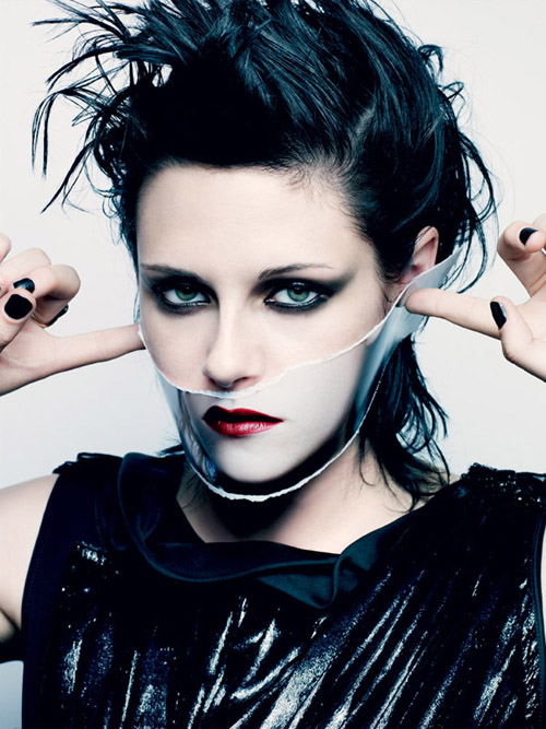 Craig McDean began his photographic career in London as a photographer's assistant to photographer Nick Knight. His early editorial work was featured in magazines such as i-D and The Face, which led to advertising campaign work for clients such as Jil Sander and Calvin Klein, and editorial commissions with Harper's Bazaar and Vogue. More recently, McDean has photographed fashion campaigns for clients including Gucci, Giorgio Armani, Emporio Armani, Oscar de la Renta, Yves Saint Laurent, Calvin Klein, and Estée Lauder. His editorial spreads are regularly featured in magazines including Vogue (magazine), W, and Another Magazine. Although primarily a fashion photographer, McDean has photographed portraits of celebrities including Björk, Madonna, Natalie Portman, Justin Timberlake, Jennifer Aniston, Joaquin Phoenix, Hilary Swank, Uma Thurman, Gael García Bernal and Nicole Kidman. His photos all look like they have a hidden meaning and the person who the photo is of look mysterious and meaningful and I will take this into account when doing my photography. I take an interest in Craig's work as he manages to take such simple photos yet they all seem so have meaning behind them. This could be due to most having piercing eye contact with the viewer and really taking your attention and focus. Not only that, he uses few colours and makes the colours in use stand out and look very vivid and powerful in contrast to the dull black, whites and greys also used. This is something I need to try and incorporate into my own work when making my magazine.
Christophe Brunnquell - was the creator of the magazine Purple,he has widely influenced how many magazines have looked nowadays, this is because his magazine was based on nearly all images, it has revolutionised the way that magazines are created. He has influenced many people to change the way in which they create their magazines, instead of focusing it on writing he has used creativity to just use images. By doing this it gives the magazines its own, unique type and separates it from the other competing magazines. For his magazines he often uses a lot large white area space, this makes me think it is distinctive from other magazines because it is different. He uses images better than other magazines I have looked at have. There is something about his images that are striking and powerful that reach out and grab you. He also uses very little colour and there is something creative and different about each individual image. This grabs the viewer and is interesting to look at. I should try to use his ideas to improve my own work.
Language Register
My magazine is going to have a semi formal language type. Some pages may have some euphemisms but this will be a rare occasion or due to quoting a band that has been interviewed. You will not see any language type that would be used in an R&B magazine such as VIBE featuring an artist like Kanye West. However the magazine may contain informal language, festival jargon and swearing that a band/artist may have used during an interview. Because Indie bands are becoming less of a rarity there will be a lot of bands featuring in the magazine which all feel they deserve respect so this will add to the exclusiveness of the magazine and attract the niche market audience i'm looking for. Furthermore bands may have polysyllabic responses to an interviewer as they will want to seem formal, intelligent and respectable in the industry. However bands may also give monosyllabic responses as they may not want to leak any information on an upcoming song or album they may be in the process of writing and this could be portrayed as rude or arrogant.
Thursday 16 January 2014
Audience Profile
My audience profile is on the student Jack Wildbore from Leicester. He currently works at Leicester City football club in the club shop as a sales assistant. Jack loves his music and has recently taken a liking to the alternative music genre. He listens to bands such as The 1975, Foals, Crystal Fighters and other similar bands. This is the exact music genre / fashion and style type that I am using as the theme for my magazine meaning Jack will be interested in what my magazine has to offer. The audience I am targeting is 15 to 25 year old males and Jack fits this category as a 17 year old lad making him a good audience profile. Jack would come under the Indie Scenesters tribe as he likes to wear clothes that make him different in a crowd. Also he attends festivals and is attending Reading festival this year for the third year running. Jack also likes to find new music and has a spotify account which lets him access loads of different music and he can search for related artists and find new music that he enjoys.
Tuesday 14 January 2014
Reflection:
During my time before making the magazine I have gone through some preparation using different equipment to prepare myself to know the skills to create my magazine.I have learnt about the different lighting's that can be used when taking a professional looking photo for a magazine. A key light, the main light that is based in front of the model that produces the most light. The fill light which is the light that is to the side of the model to fill in the shadows that may be on the models face. They will be the lights i'm using. Another light that could be useful would be a hairline light that is located above the model, it adds more light to the picture if you are using all three lights or you could use it on its own to produce a heavenly like light/theme thus creating a different mood in the photo. I have also learnt how to use a tripod to find the best angles and heights to take my photo at. I then learnt how to use Photoshop to produce the photo in the best way I can by editing, air brushing, cropping and cutting them. I will also select different colours and text to compliment my photo and make it to the best of my ability.
During my time before making the magazine I have gone through some preparation using different equipment to prepare myself to know the skills to create my magazine.I have learnt about the different lighting's that can be used when taking a professional looking photo for a magazine. A key light, the main light that is based in front of the model that produces the most light. The fill light which is the light that is to the side of the model to fill in the shadows that may be on the models face. They will be the lights i'm using. Another light that could be useful would be a hairline light that is located above the model, it adds more light to the picture if you are using all three lights or you could use it on its own to produce a heavenly like light/theme thus creating a different mood in the photo. I have also learnt how to use a tripod to find the best angles and heights to take my photo at. I then learnt how to use Photoshop to produce the photo in the best way I can by editing, air brushing, cropping and cutting them. I will also select different colours and text to compliment my photo and make it to the best of my ability.

 The genre I have chosen for my magazine is an indie theme. I have chosen this as I like to listen to more alternative music so it's more down my street. Also I feel it may be an easier magazine to be able to create.
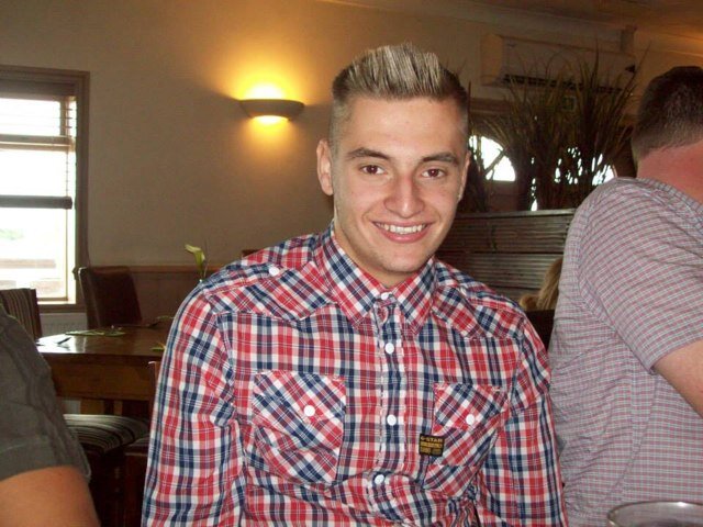
I am going to base my magazine on the same sort of style as NME. A basic but attractive layout that clearly shows the artist off. I am going to find a model that I can work with to make them represent the music type similar to The Wombats, The Killers and The 1975 genre/style. I will do this by making my model wear specific clothes similar to the ones in the photo above.
Today's Targets: By the end of today I want to have completed the today's lesson tasks to the best of my ability and have a good idea what genre of magazine I want to create and how I shall do that.
Weekly Targets: By the end of the week I want to have completed the level 4 targets set on Mr Smith's blog and analyse my favorite magazines in more detail.
Weekly Targets: By the end of the week I want to have completed the level 4 targets set on Mr Smith's blog and analyse my favorite magazines in more detail.
Friday 10 January 2014

Magazine Prelim

How does your prelim represent particular social groups?
As it is a school magazine the theme is obviously academic. This means it is aimed at students aged between 14 and 19 or years 10 - 13 at Lutterworth College which is a school with an approximate population of 2000 students. This is a niche market and this magazine will only be relevant to the students that attend the school. Also it will stereotypically seem to be more aimed at the nerdy type of social groups but including music and sporting news may attract other potential readers.
Who would be the intended audience for your product?
The intended audience will be any student that attends Lutterworth College that wants to keep up to date with what is new and happening at the college. The intended audience will be the more nerdy type social groups as stereotypically they would be more interested in the magazine. However including news from the schools music and sporting achievement's may attract other audiences.
How did you attract/address your audience?
I attracted my audience by using a photo of the schools head boy as he can be seen as a role model and someone to aspire too, to a lot of the students of Lutterworth College. I also used some recent news on the front cover about the head boy delivering a riveting speech to hook my audience. However if I was to redesign this now I would know to include sporting and music opportunities and achievements on the front page to attract a different variety and more of an audience.
What have you leant about technologies from the process of constructing this product?
I have leant that photoshop can be a difficult piece of software to use. It takes time to understand how to use all of the products and processes on the software and how to incorporate them into your work effectively to make it look realistic and professional.When I use the software to create my real magazine I will ensure I have properly developed my skills on it properly.
In this video we leant about the three important lightings needed to take a good photo.
Key Light: This is the main light out of the three lights, it is usually located directly in front of the subject and it puts lighting focus on the subject.
Fill Light: The fill light is usually located to the side of the subject to fill the shadows in that can be found on the subjects face.
Hair Light: This light helps to separate the subject from the background and helps create a more vivid picture.
Thursday 9 January 2014


Tuesday 7 January 2014
Subscribe to:
Posts (Atom)